Men's Grooming · Website Revamp
Dari Mooch
A revamp of Dari Mooch — a men's grooming and beard-care brand — rebuilt around a bold, masculine identity and cinematic product storytelling.
01
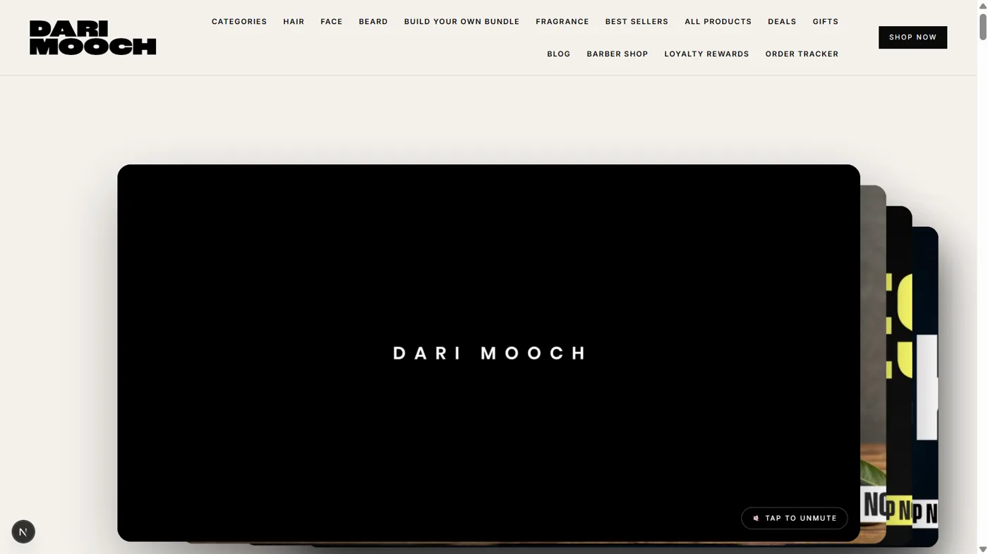
Reimagined Hero
The Dari Mooch hero was reimagined around a bolder brand statement and cleaner composition. Confident typography, purposeful spacing and refined imagery replace the busier original, putting the brand front and centre. The result feels distinctly more premium and masculine while staying true to the existing identity.
02
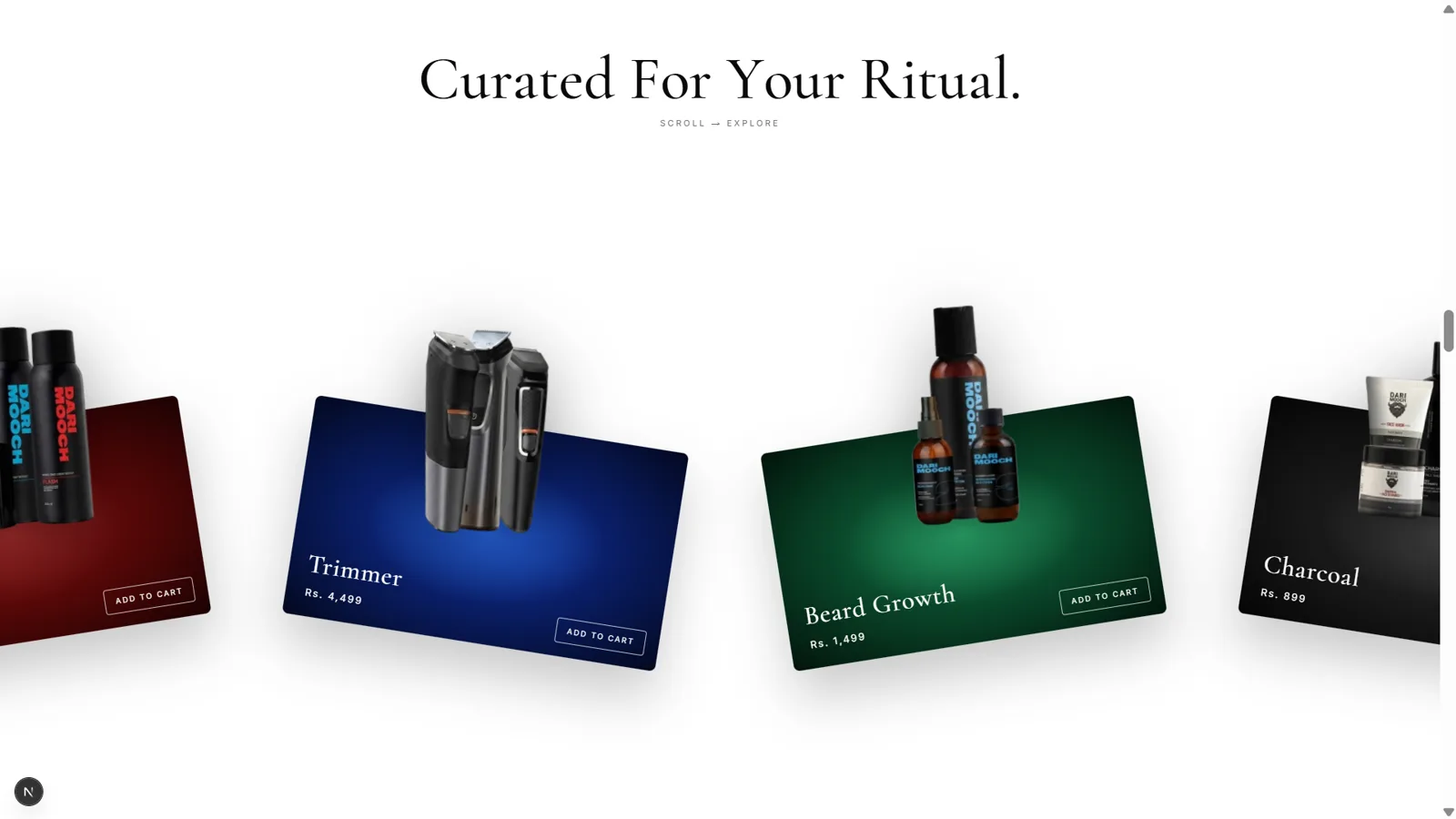
Curated For Your Ritual — Horizontal Scroll
A row of coloured product cards — Trimmer, Beard Growth, Charcoal and more — slides sideways as you scroll down the page. The section is pinned and vertical scroll is converted into horizontal movement with GSAP: the track is driven by x: -(trackWidth − viewportWidth) with scrub: true, so your scroll position moves the cards 1:1 for a tactile, gallery-like browse through the range.
03
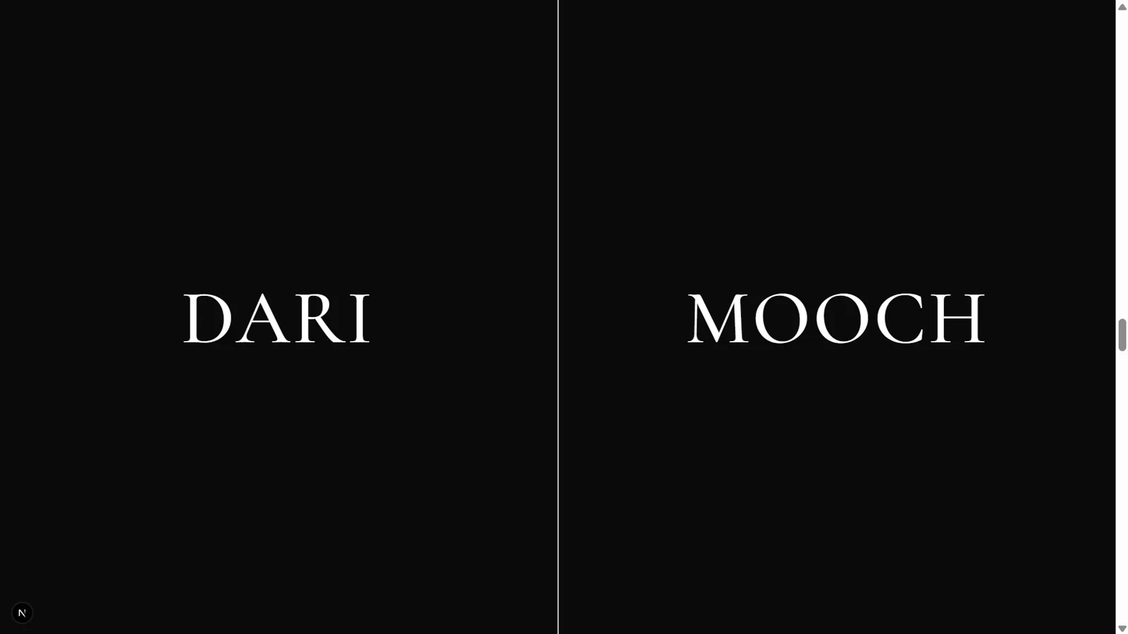
Split Screen — DARI | MOOCH
Two black halves reading DARI and MOOCH split apart like curtains to reveal what sits behind them. The section is pinned and both panels are scrubbed — the left half animates to xPercent: -100 and the right to xPercent: +100 — so they slide off-screen in opposite directions as you scroll, a bold brand moment built straight from the logo.
04
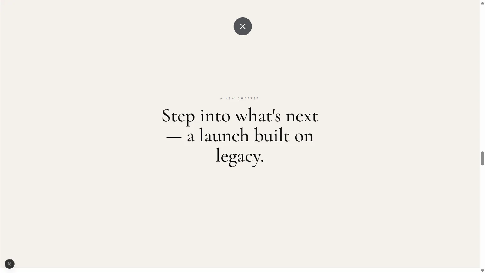
Split Reveal — A New Chapter
Centred between the split panels sits the line “A new chapter — step into what's next, a launch built on legacy.” It shares the same pinned split-section: as the DARI/MOOCH curtains slide open, this heading is revealed and animates from yPercent: 40 → 0 with a scrubbed fade-in. Curtain closed is this moment; curtain open reveals the split screen behind it.
05
New Launch Showcase
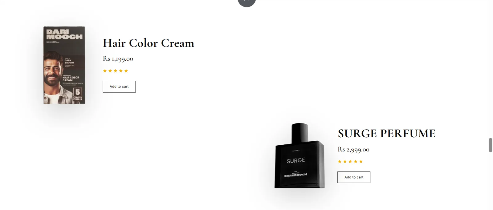
Two large product rows — Hair Color Cream and Surge Perfume — pair a product image on one side with name, price, star rating and a buy button on the other. Each row triggers when it reaches 80% of the viewport: a timeline slides the media in from the left (x: -90 → 0) and staggers the info in from the right (x: 60 → 0), playing on enter and reversing on leave for a lively, reactive feel.
06
Best Price Ring
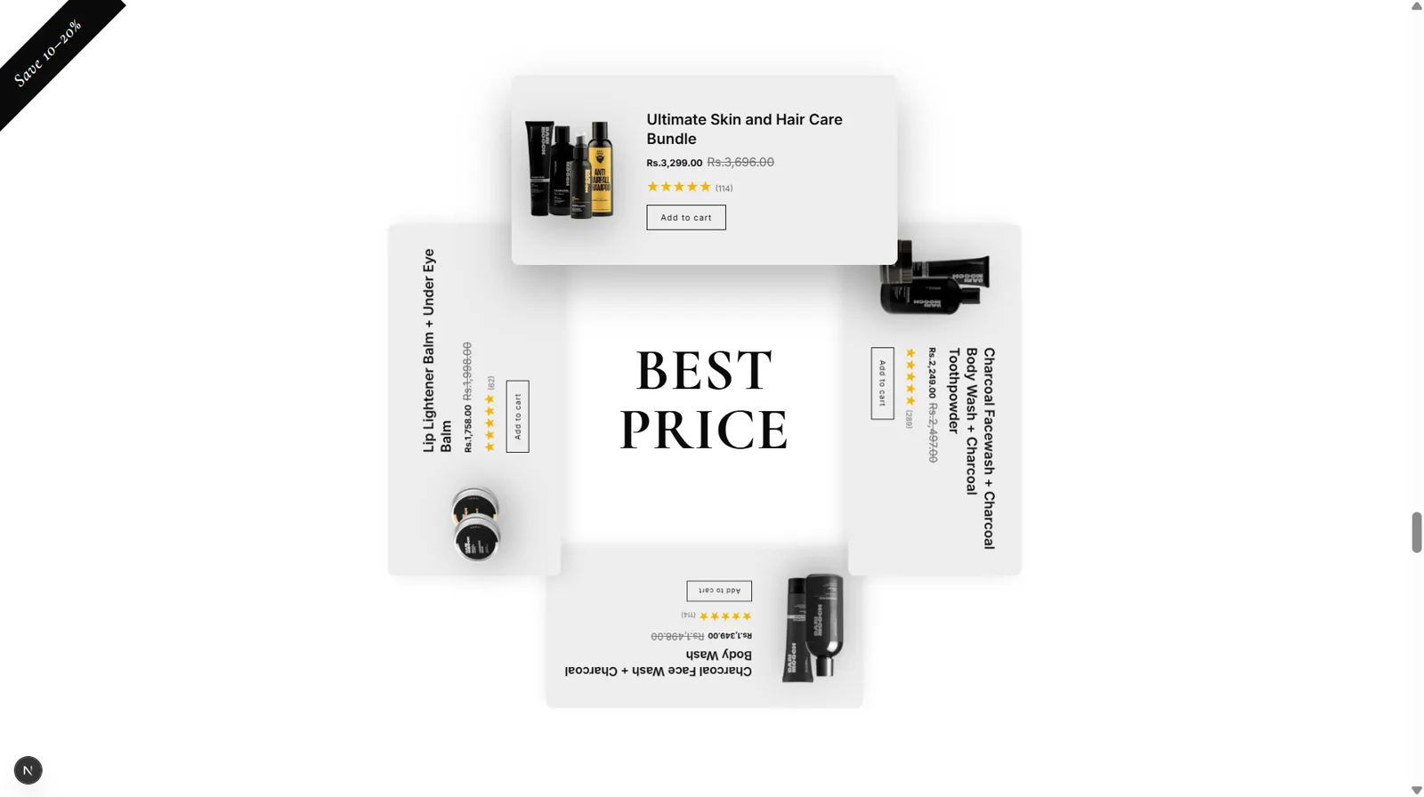
Four bundle cards are arranged on an invisible circle around a central “BEST PRICE” label, and scrolling spins the ring. The section is pinned; each card's angle is basePosition + scrollProgress × 360°, positioned with x = sin(deg)·r and y = -cos(deg)·r and rotated to match. Whichever card reaches the top is “selected” — cos(deg) peaks at the top, scaling that card up and raising its z-index.
07
Categories — Face
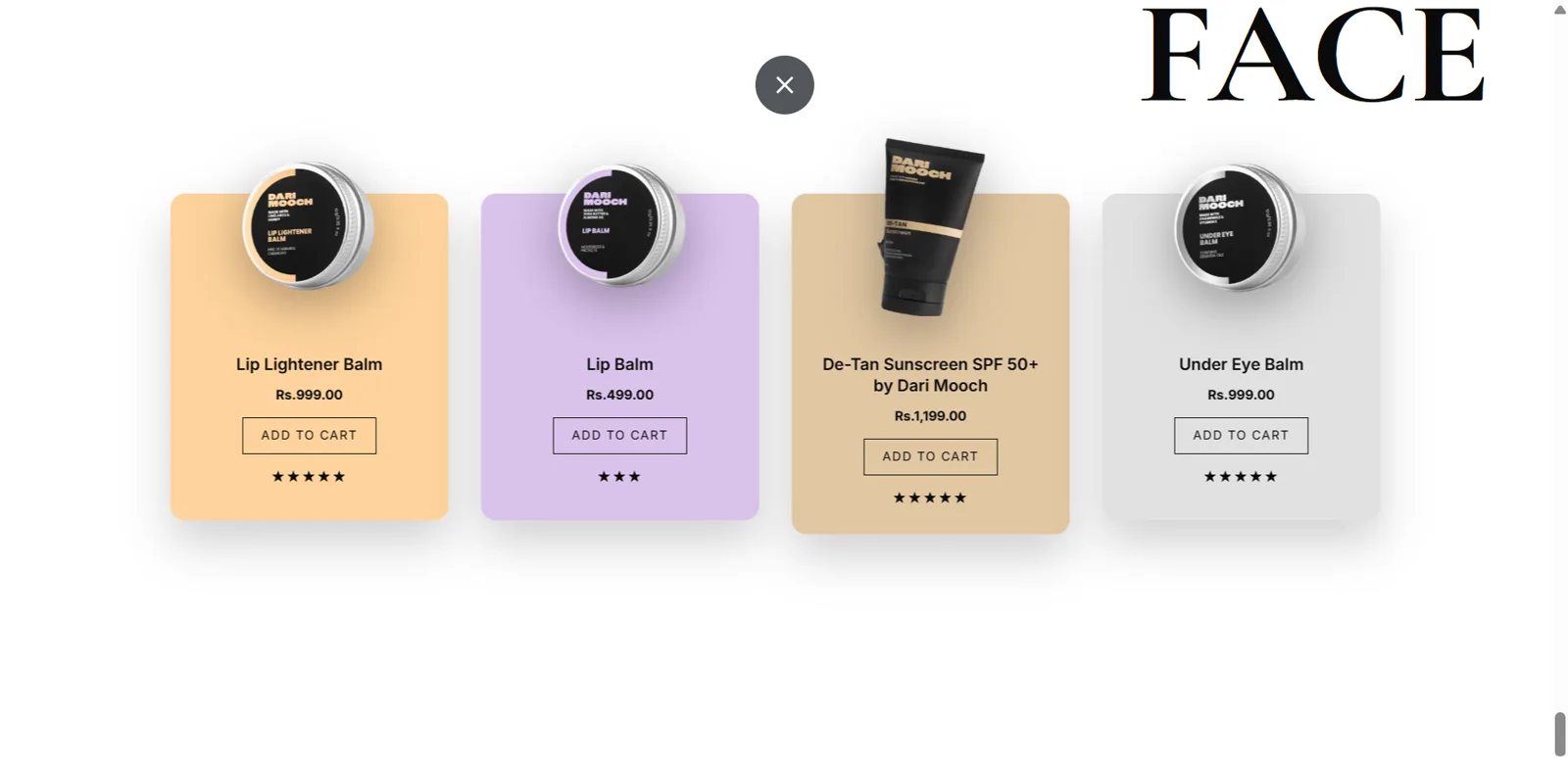
The Face products (Lip Balm, Sunscreen and more) begin as a messy, stacked deck and spread into a clean, centred row as you scroll. The block is pinned; cards start offset and rotated (x: 90 + i·22, rotation) and a scrubbed timeline animates each to its computed row position with rotation: 0, so they fan out into order while the “FACE” title slides in from the right.
08
Categories — Hair
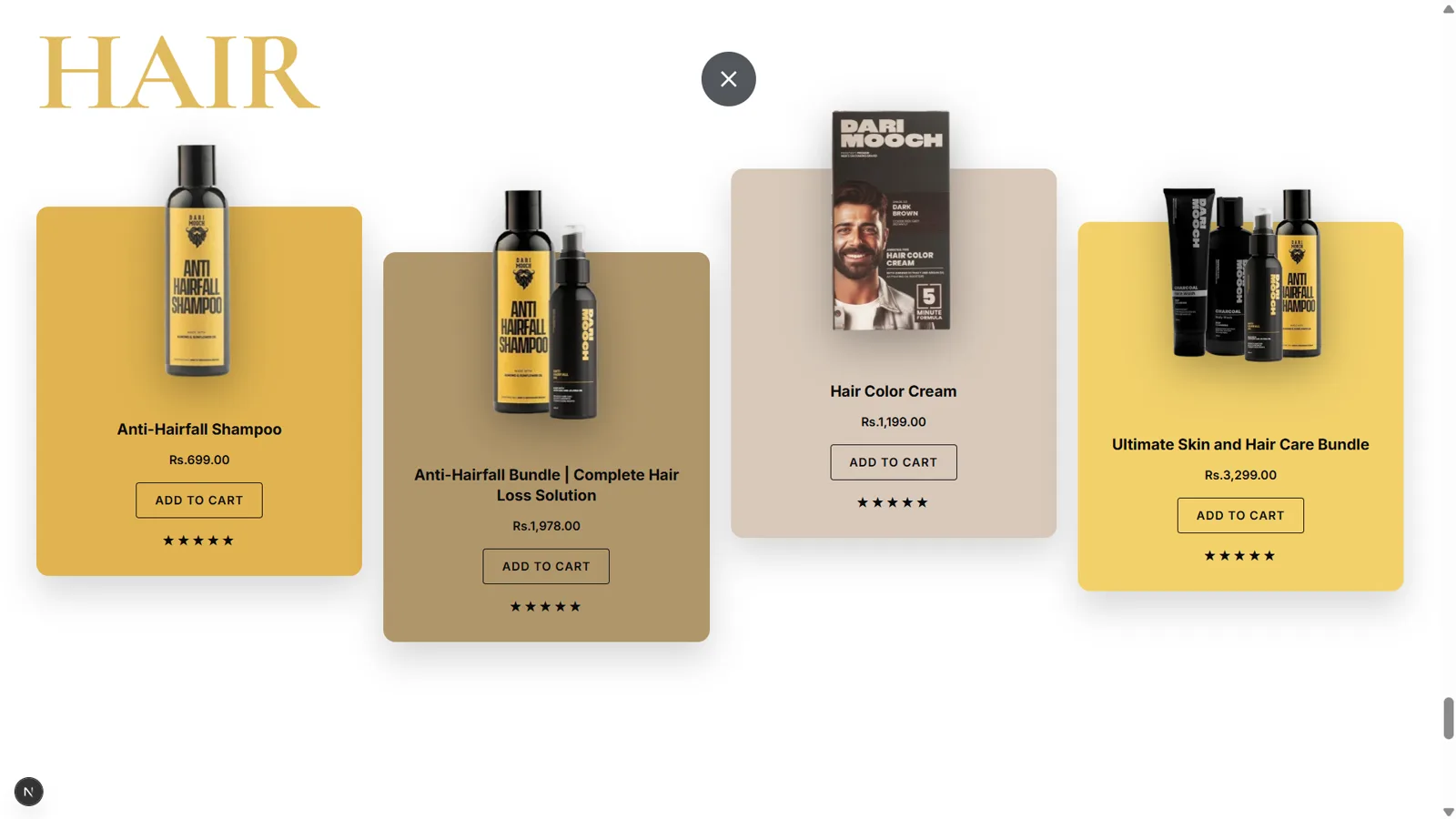
The Hair cards (Anti-Hairfall Shampoo, Hair Color Cream and more) are staggered at different heights for a playful arrangement. This is a simpler reveal: cards animate up from below the viewport (y: innerHeight → 0) with a back.out(1.6) bounce and a 0.2s stagger, triggered as the block hits 75% of the viewport.
09
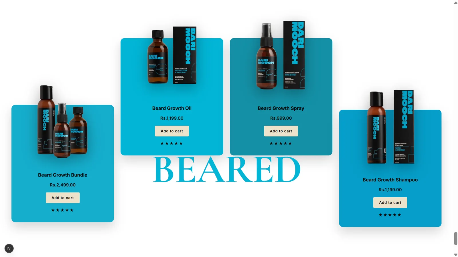
Categories — Beard
The Beard cards sit in front of a big “BEARED” title. It mirrors the Hair section, but the cards drop in from above (y: -innerHeight → 0) with the same bounce and stagger. All three category titles — like the footer heading — use a letter-by-letter reveal, each split into character spans that rise and rotate in on scroll.

10
Footer — Join the Brotherhood
A dark closing panel built around a big serif “Join the Dari Mooch Brotherhood” heading, supporting subtext and the copyright line. The heading uses the same split-letter reveal — characters rising and rotating in — while the paragraph fades up (y: 30 → 0) as the footer enters at 85% of the viewport, leaving a confident, polished final impression.
For comparison
The original website
These screens are my own revamp concept — not the live site. Open the original to compare the landing page side by side.
View original site