Fragrance · Website Revamp
Elyscents
A revamp of Elyscents — a premium fragrance house — redesigned around atmosphere, scent storytelling and an elegant shopping experience.
01
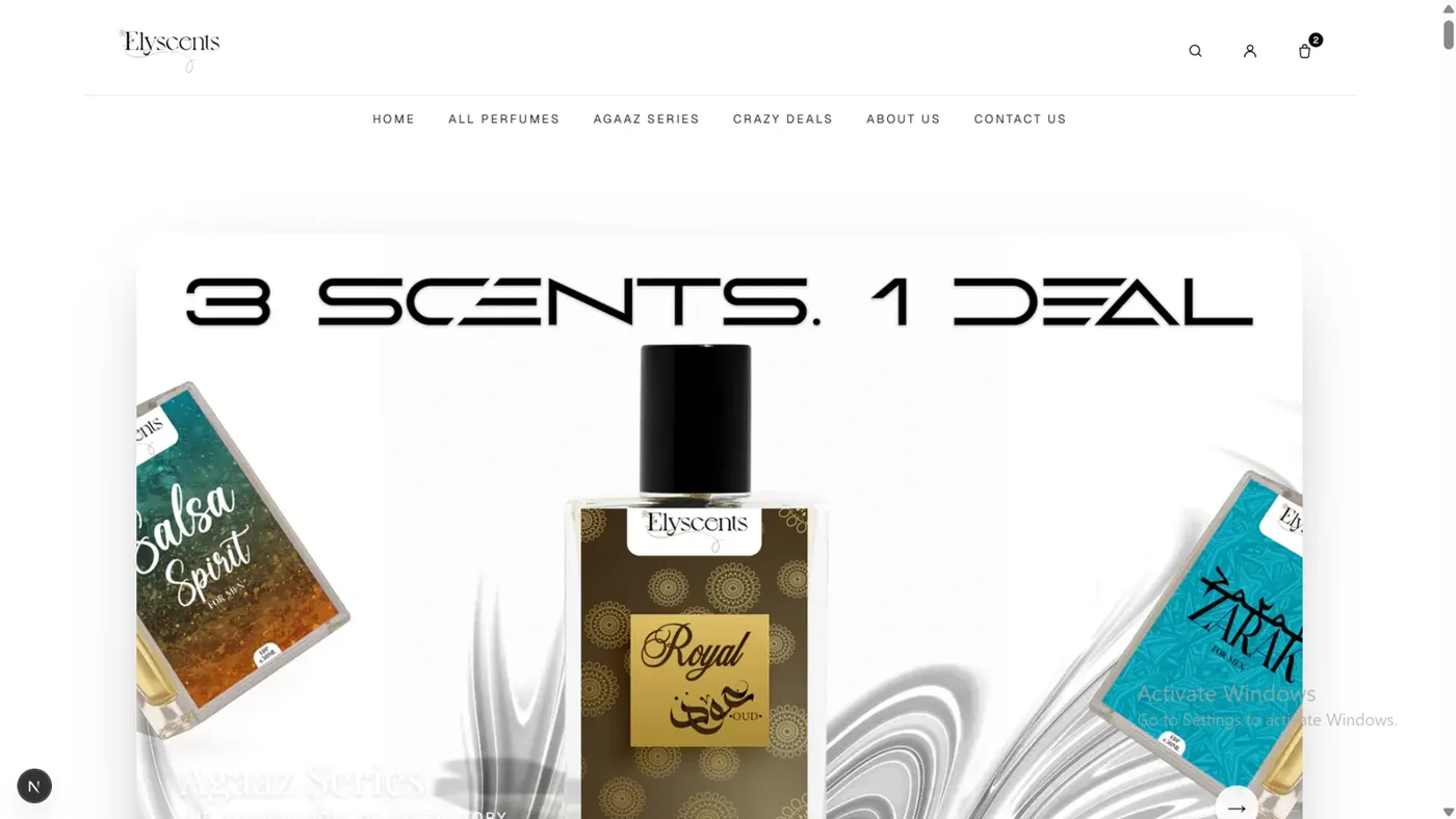
Header + Hero
Top bar with the Elyscents logo, full navigation (Home, All Perfumes, Agaaz Series, Crazy Deals, About Us, Contact Us) and search, account and bag icons — the cart showing a live count. Logo and links animate in with Framer Motion. The hero is a pinned stack of banner cards (“3 Scents. 1 Deal” and more); as you scroll, GSAP fans the stacked cards out and flings each one up and away to reveal the next, with pagination dots below.
02
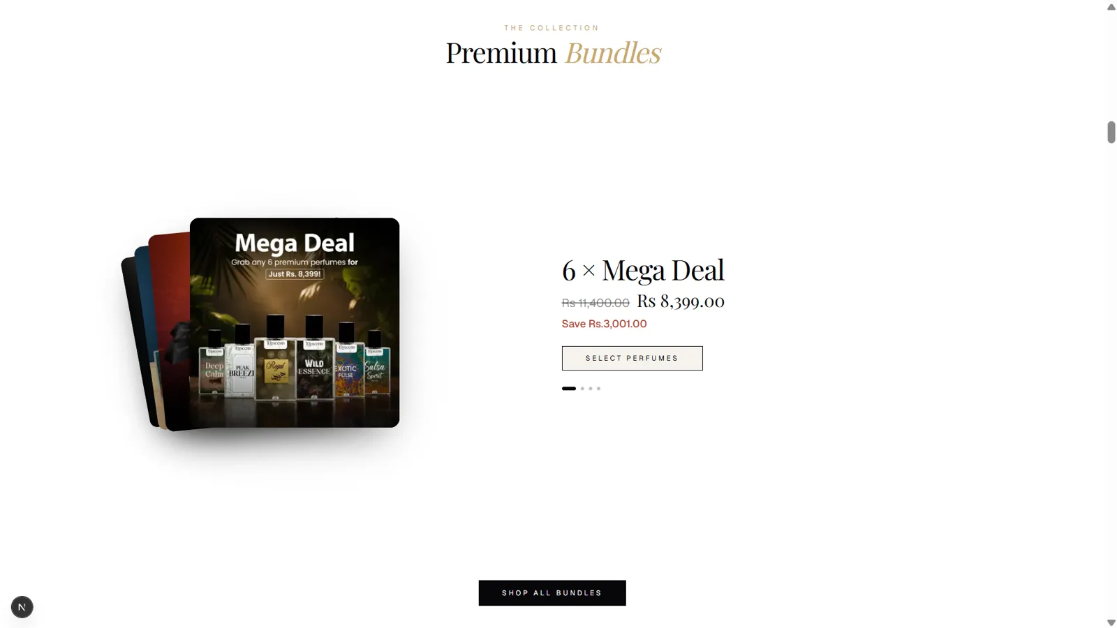
Premium Bundles
A fanned deck of bundle cards on the left with product details on the right — title, was/now pricing in red, “Save Rs…”, a Select Perfumes button and progress dots. The section is pinned: scrolling flips through four bundles (Mega Deal → Flash Deal → Triple → Royal Duo), snapping the active card to the front while the detail panel cross-fades. A Shop All Bundles button sits at the bottom.
03
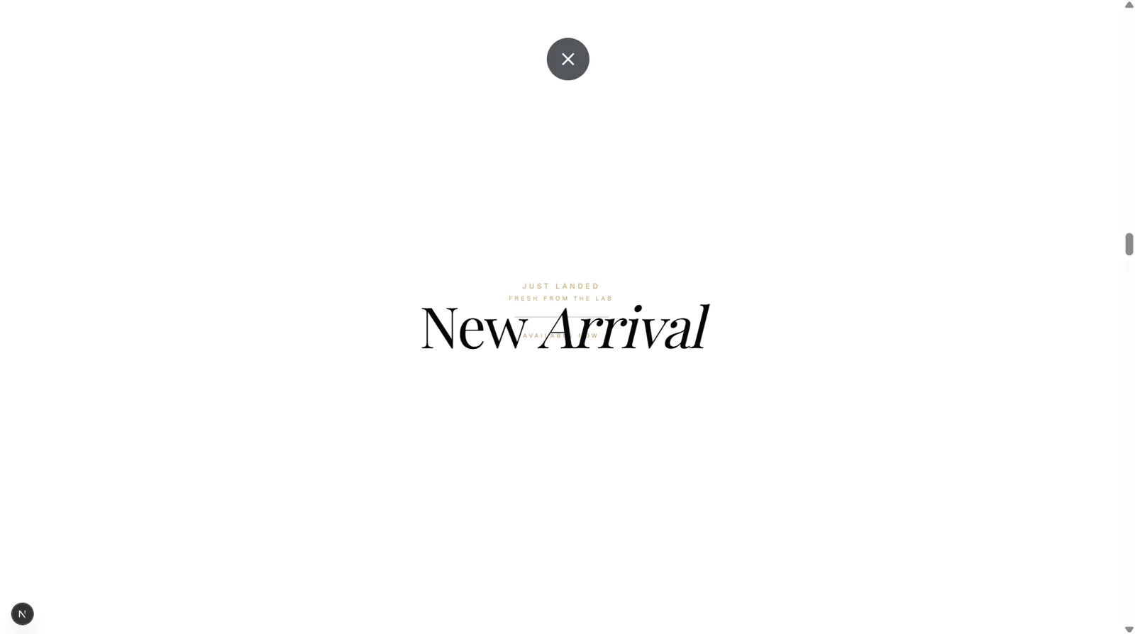
New Arrivals — Intro
The “New Arrival” title screen. The section opens as two white panels covering the screen with the heading centred between them — a clean, theatrical entrance that sets up the reveal that follows.
04
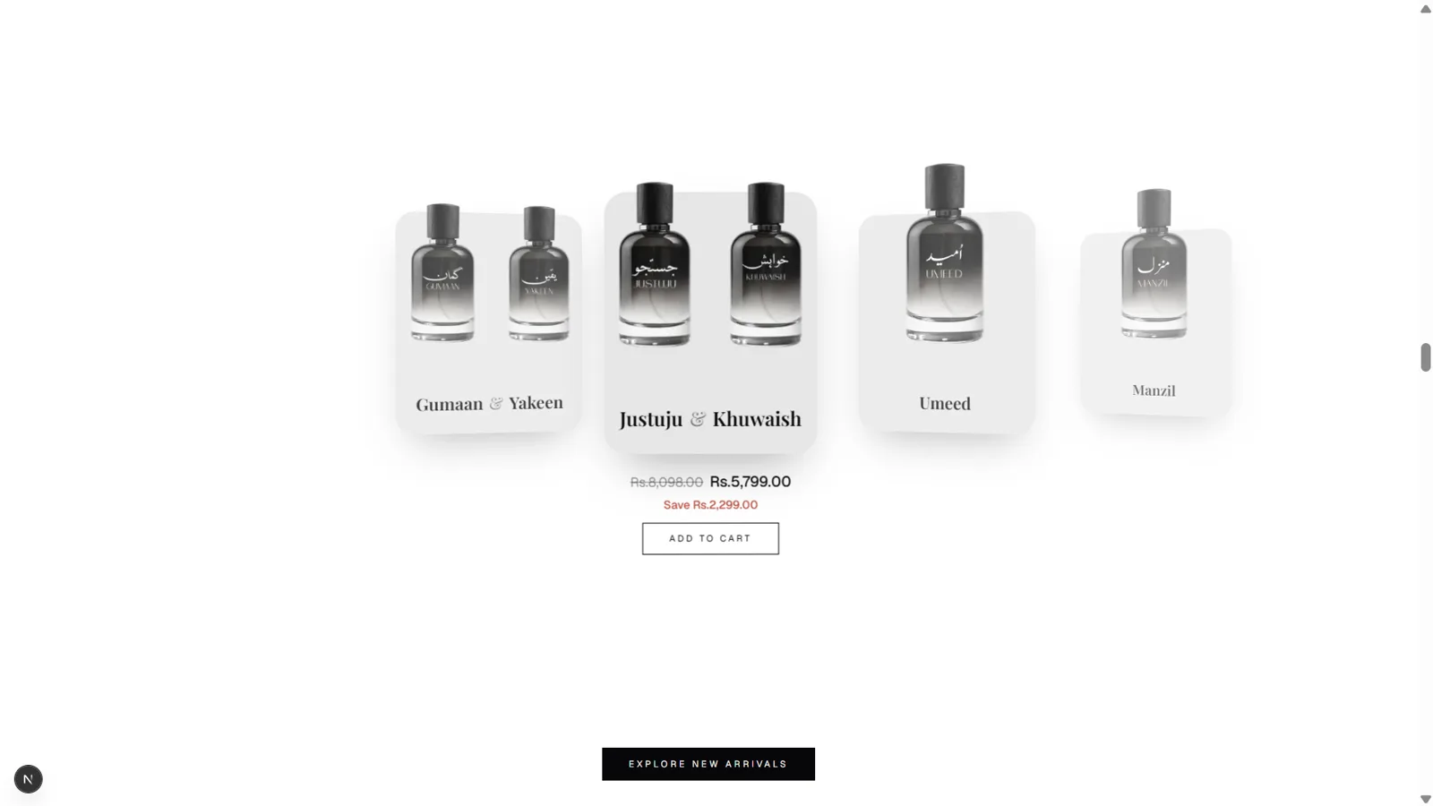
New Arrivals — Coverflow
As you scroll, the two white panels split apart — top sliding up, bottom sliding down — to reveal a 3D coverflow carousel of product cards. The centred card scales up and tilts to face you, and only it shows price and Add to Cart. The track auto-slides horizontally with scroll, with an Explore New Arrivals button below.
05
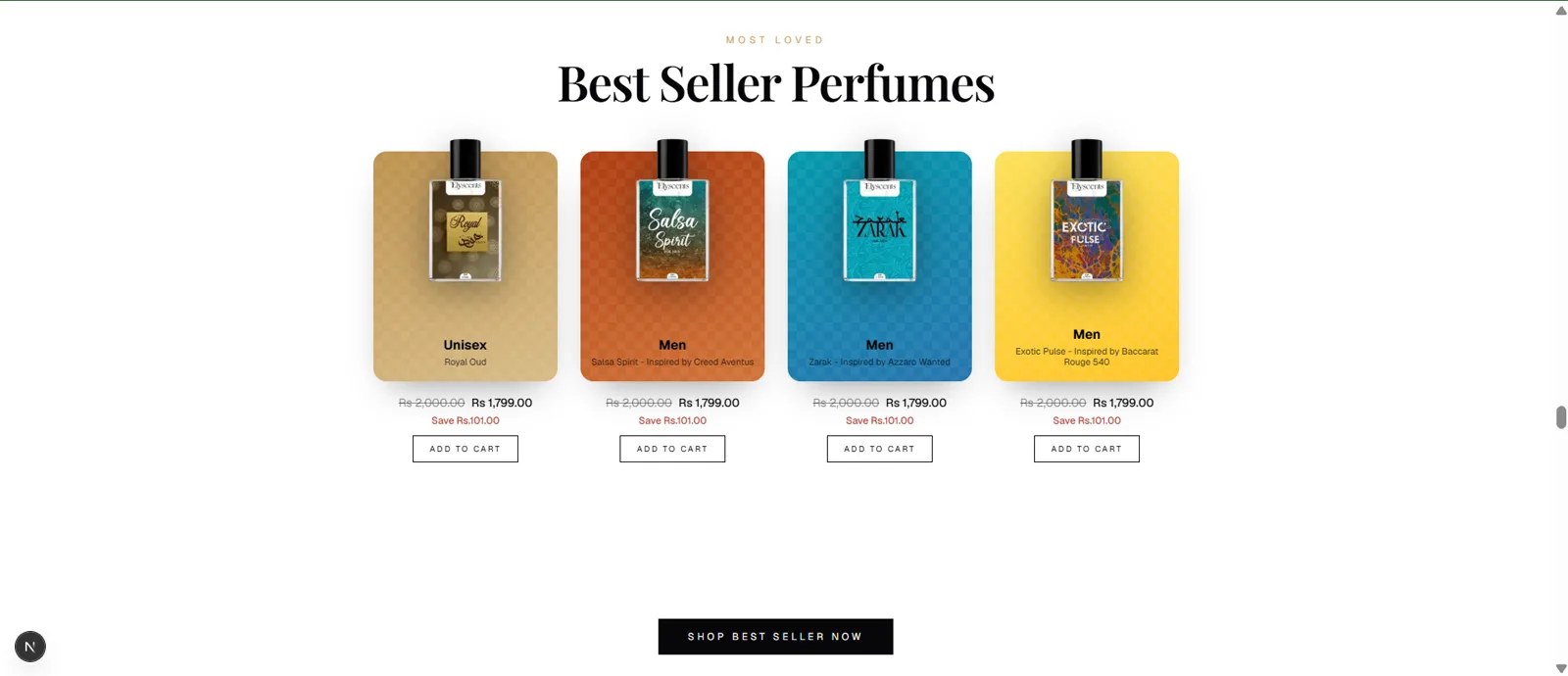
Best Sellers
A row of four coloured gradient cards (“Most Loved / Best Seller Perfumes”), each with a bottle bleeding out the top of the card, plus tag, name, price, Save and Add to cart. Pinned: the heading drifts up from centre, then the cards rise in from below with a stagger, then prices and CTAs fade in. A Shop Best Seller Now button anchors the bottom.
06
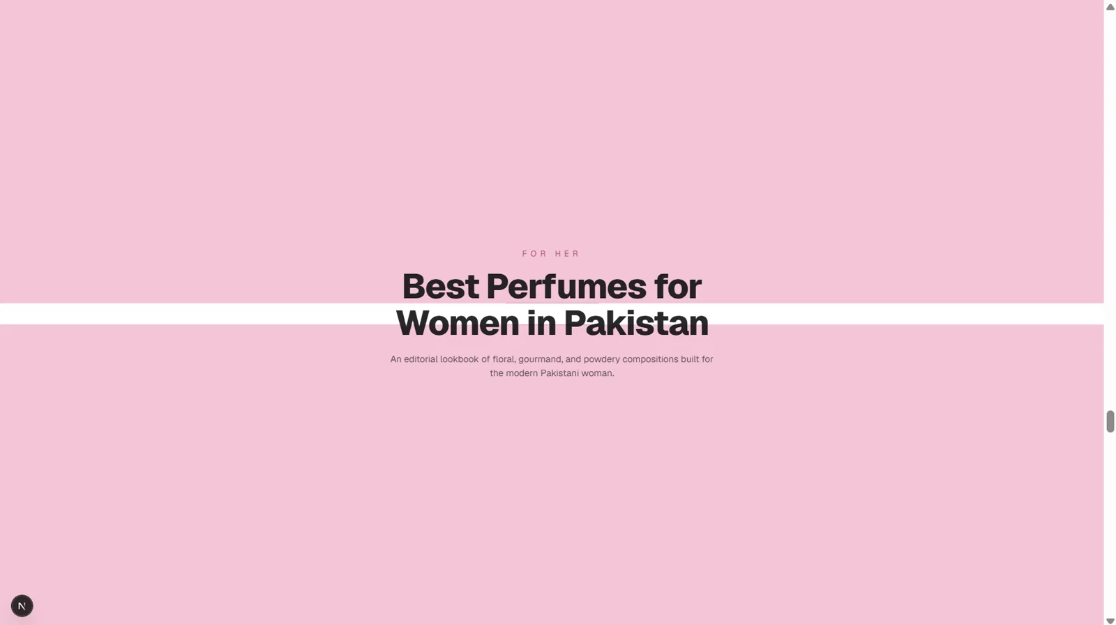
For Her — Intro
A full pink panel introducing “For Her / Best Perfumes for Women in Pakistan” with a supporting subtitle. It uses the same tear-apart mechanic as New Arrivals, but here the covering panels are pink to match the section’s mood.
07
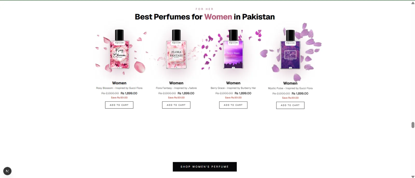
For Her — Products
The panels tear open to reveal four women’s bottles, each floating over rose-petal graphics with its name and inspiration, price, Save and Add to cart. A Shop Women’s Perfume button closes the section.
08
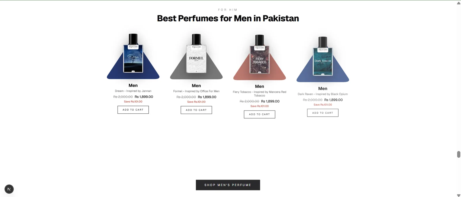
For Him — Products
The same pattern as the women’s section, reframed as “For Him”. The distinctive touch: each bottle sits on a rounded-triangle, cone-shaped coloured card drawn with an SVG path for a spotlight look. A Shop Men’s Perfume button sits below.
09
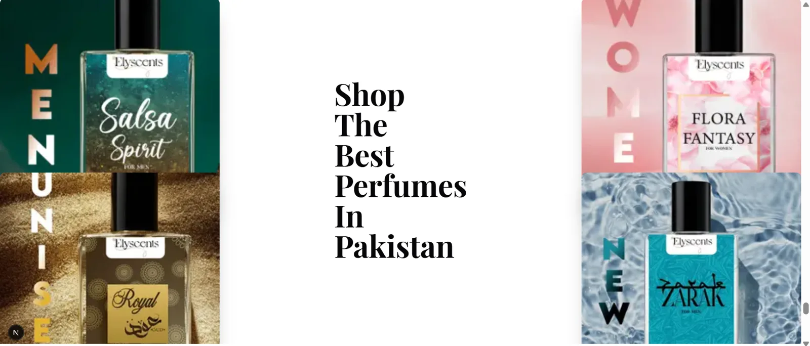
Shop The Best Perfumes
Four large square lifestyle images — two hugging the left edge, two the right — with the headline “Shop The Best Perfumes In Pakistan” in the clear centre gap. Pinned: the cards fan out from a tilted pile on the left into this 2-left/2-right layout while the heading slides in from the right and swaps to a one-word-per-line arrangement.
10
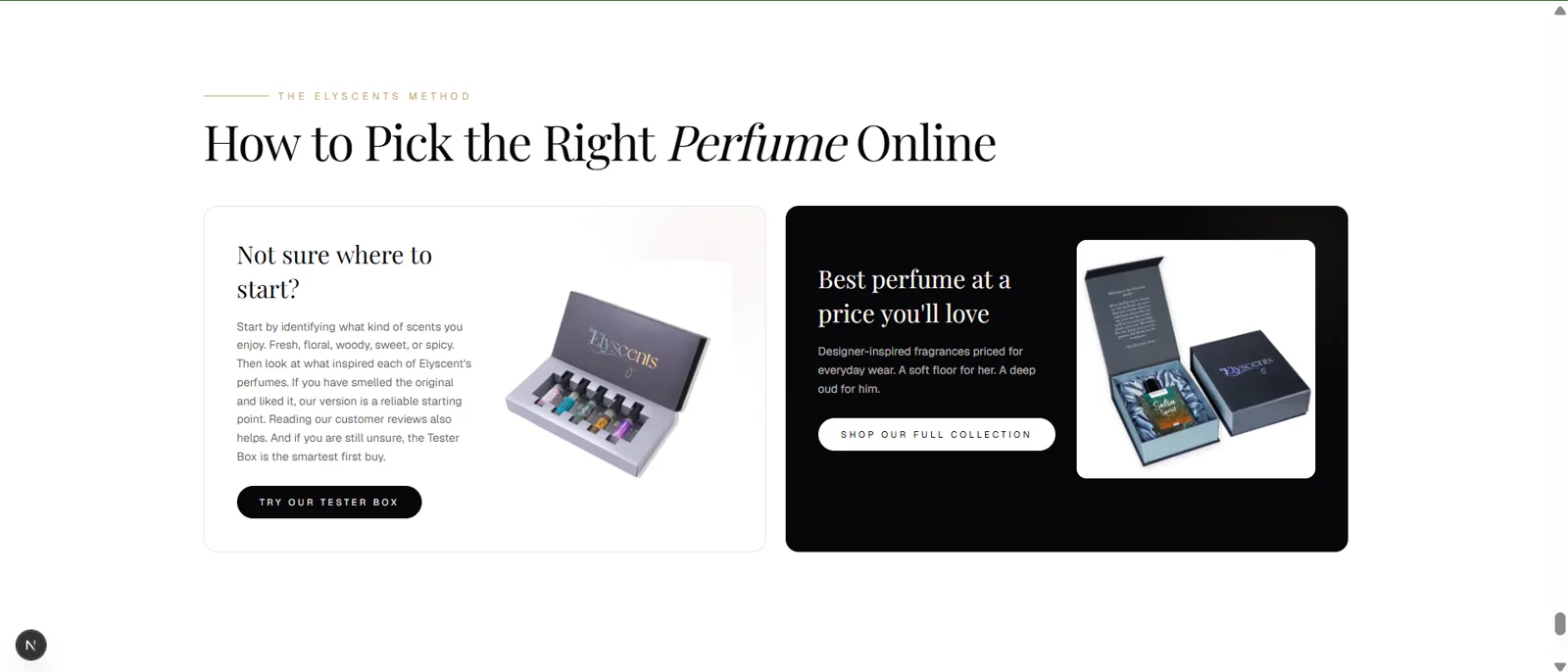
How To Pick
A normal (non-pinned) scroll section with an animated heading, “How to Pick the Right Perfume Online”, and two CTA cards — a light “Not sure where to start? → Try our Tester Box” and a dark “Best perfume at a price you’ll love → Shop our full collection”. Images carry a subtle parallax and scale on scroll, with a word-by-word heading reveal.
11
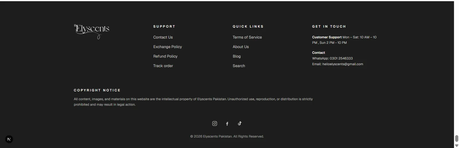
Footer
A dark footer with the logo and four columns — Support, Quick Links, and Get in touch via WhatsApp and email — plus a copyright-notice paragraph, social icons (Instagram, Facebook, TikTok as inline SVGs) and the “© 2026 Elyscents Pakistan” line.
For comparison
The original website
These screens are my own revamp concept — not the live site. Open the original to compare the landing page side by side.
View original site