Logistics · Website Revamp
TCS
A full visual revamp of TCS — Pakistan's largest courier network — reimagined with a cleaner, tracking-first experience and a modern, trustworthy interface.
01
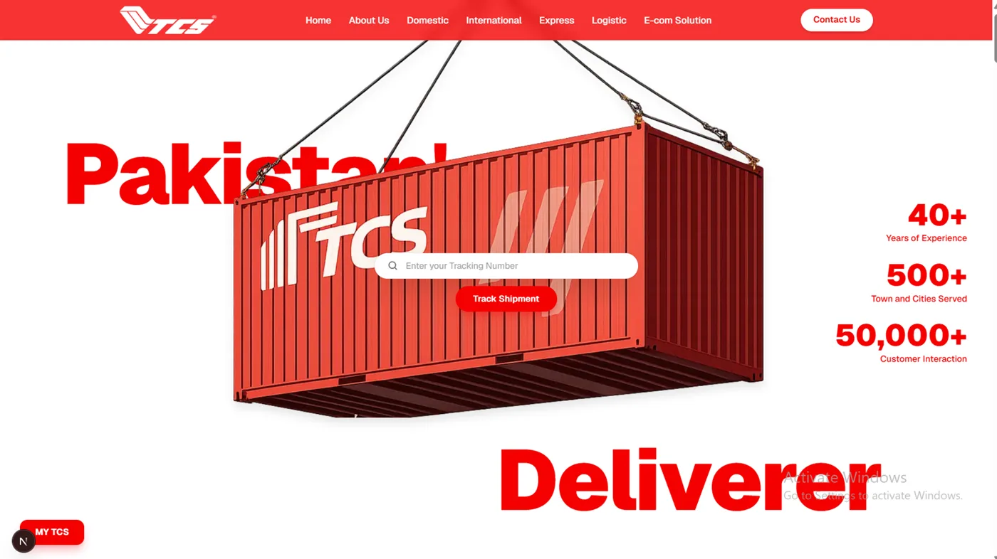
Hero — Suspended Container Landing
A red shipping container hangs by cables in the centre of the screen, framed by the giant word “Pakistan” top-left and “Deliverer” bottom-right. Its face carries the TCS logo and an “Enter your Tracking Number” search bar with a Track Shipment button, while animated stat counters tick up on the right — 40+ Years, 500+ Towns & Cities, 50,000+ Customer Interactions. The fixed navbar sits above it. The container is “lowered in” as the anchor for everything that follows.
02
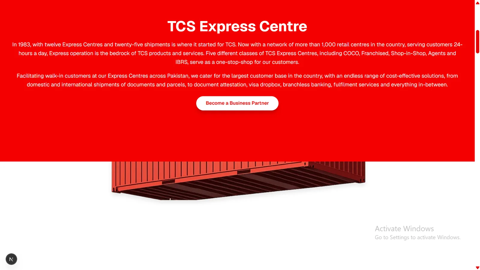
TCS Express Centre — Red Curtain Drop
As you scroll, a solid red panel drops down from the top like a full-bleed overlay, wiping over the still-pinned container so only its lower edge peeks out beneath. The panel reveals the “TCS Express Centre” heading and history copy — started 1983, 1,000+ retail centres, COCO / Franchised / Shop-in-Shop / Agents / IBRS — alongside a Become a Business Partner button.
03
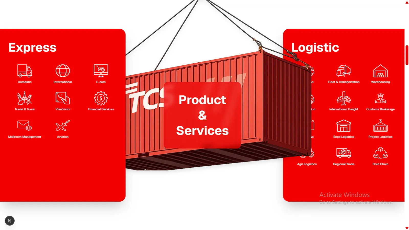
Product & Services — Sliding Panels
The container is centred and pinned while two red panels fly in from off-screen: Express enters from the left (xPercent: -110 → 0) to sit above the container's left edge at z-30, and Logistic enters from the right (xPercent: 110 → 0) to tuck behind its right edge at z-10. Their service icons fade and rise in with a stagger, then the central “Product & Services” card pops with a back.out scale bounce at z-40 — fully reversible on scroll-up.
04
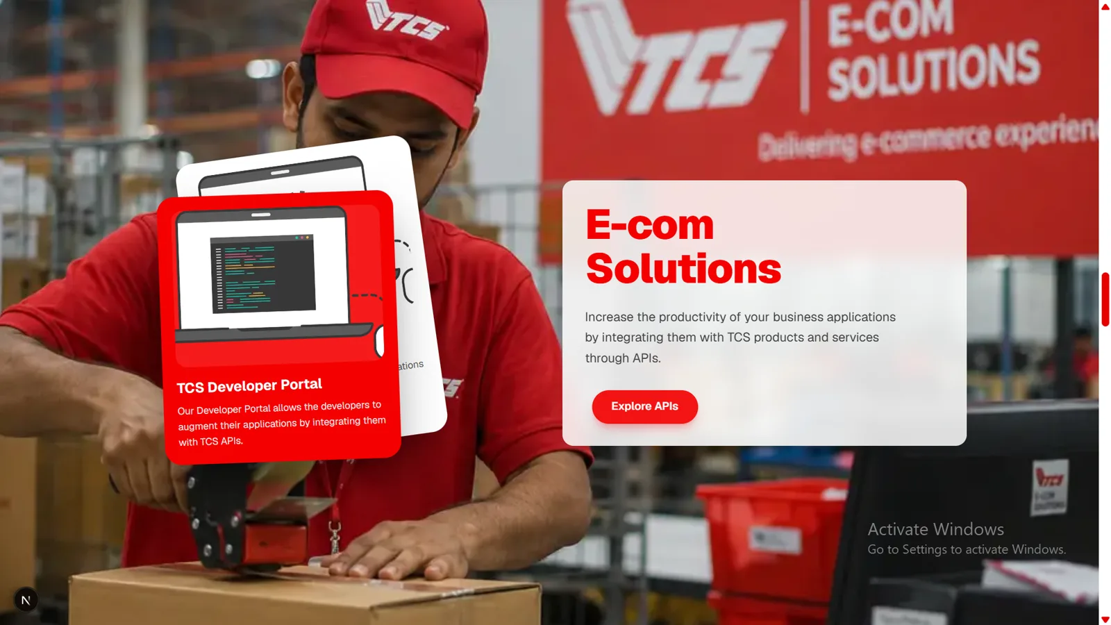
E-com Solutions — Layered Cards
The background switches to a photo of a TCS worker taping a box in a warehouse. A frosted-glass card on the right holds “E-com Solutions” with an Explore APIs button, while on the left a stack of cards — a white one behind and a red “TCS Developer Portal” card in front — animate and overlap in a layered card-shuffle that promotes the developer API story.
05
CSR Activities — Modal Gallery
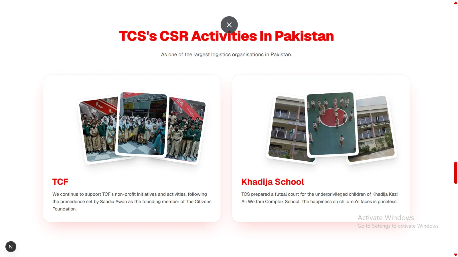
This section is presented like an opened dialog, complete with a ✕ close button at the top. The heading “TCS's CSR Activities In Pakistan” sits above two cards — TCF and Khadija School — each showing a fanned-out stack of tilted, polaroid-style photos over its description. The photo stacks read as an entrance-fan / spread-on-hover gallery.
06
Customer Support — Radial Layout
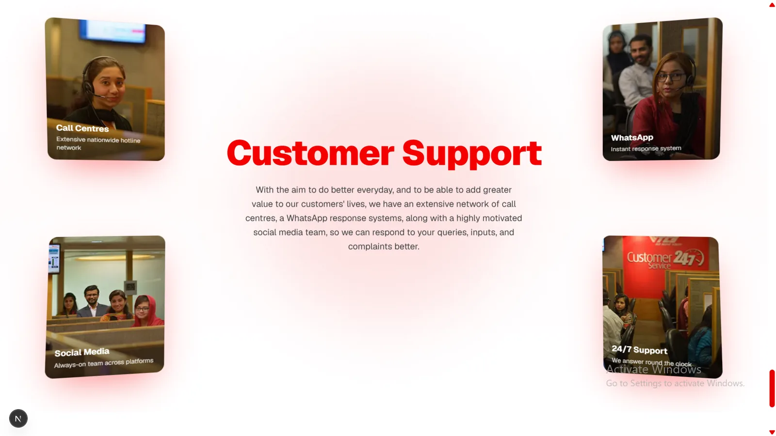
A centred radial layout places the “Customer Support” title and paragraph in the middle, with four photo cards floating into the corners — Call Centres (top-left), WhatsApp (top-right), Social Media (bottom-left) and 24/7 Support (bottom-right). Each card carries a soft red glow and animates inward to settle symmetrically around the central text.
07
Footer
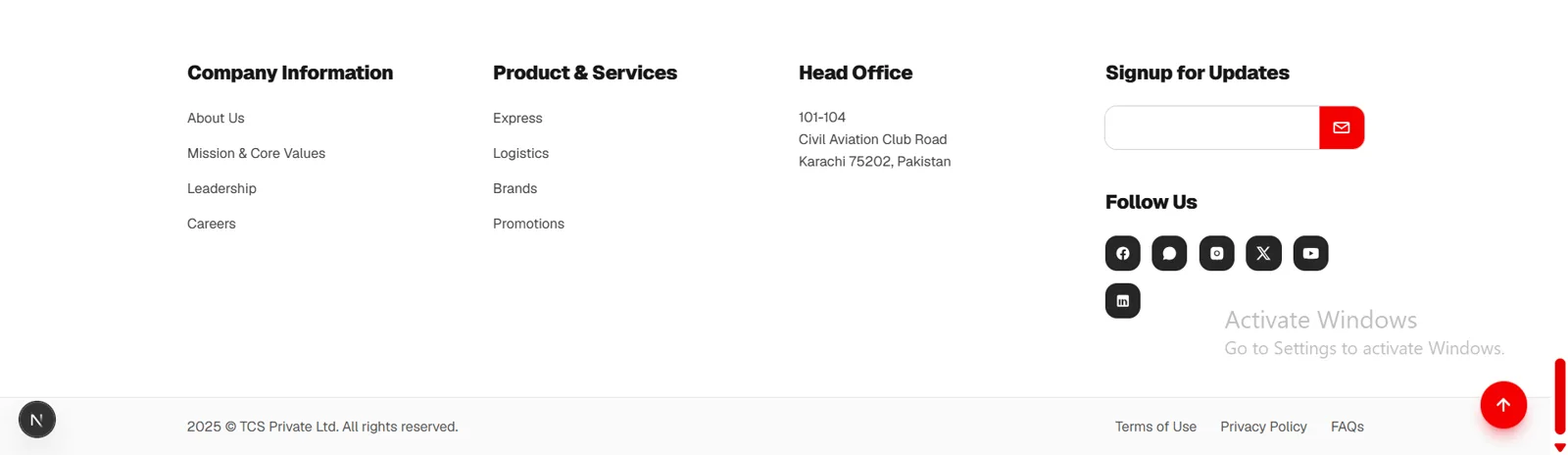
A clean, light footer in four columns — Company Information, Product & Services, the Karachi Head Office address, and a Signup for Updates block with an email field and Follow Us social icons. A bottom bar carries the copyright, Terms / Privacy / FAQs links and a red scroll-to-top button, rounding out the experience.
In motion
Watch the walkthrough
See the revamp come alive — press play for the full experience with sound.
For comparison
The original website
These screens are my own revamp concept — not the live site. Open the original to compare the landing page side by side.
View original site